How Many Cows Are The in the World?
Tracking the Global Cattle Inventory: 1 Billion Cows
A few weeks ago I saw a chart claiming that the global population of cows had been hovering at around one billion since the 70s. If true, this would be huge. Rather than getting into the nitty gritty of land use, methane, byproducts, efficiency, and all the other details that come up when trying to responsibly discuss cows and the environment, a more or less stable global cattle population coupled with steadily increasing levels of atmospheric carbon would clearly make the fundamental point: the first order cause of climate change is the burning of fossil fuels, with cattle and a host of other factors real but less significant contributors. If we didn’t have any more cows now than fifty years ago, how much of a problem could they really be?
When I started looking into it I did indeed find reputable sources to back up the claim of a stable global population of about a billion. All of these were based on USDA data. But I saw other charts, also based on USDA data, that put the number at closer to 1.25 billion.

Using data from the USDA Foreign Agricultural Service I was able to reproduce these. The difference arises from whether data on “total supply” or “ending stocks” is selected. I’ve tried to find out exactly what these mean, and I’ll update this post if I do. I suspect “Total Supply” is all of the cows that lived in a calendar year rather than the average number alive at any one time. If this is the case, it’s an overstatement of the actual number, but both measures show very similar trends. (Note the calibration in this and all subsequent graphs; the Y axis is not pegged to zero in any of them.)
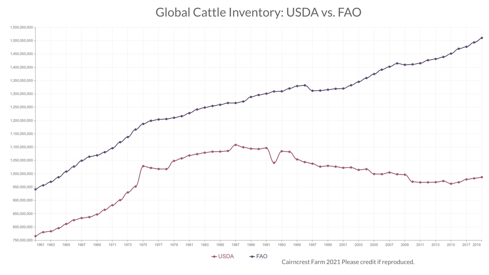
Or is it 1.5 Billion Cows?
But when I spotted a source based on FAO data, the chart looked quite different, with global cattle population steadily rising from one billion to roughly 1.5 billion in the same time frame. Even more important than the actual number is the difference in trend. Whether the number of cows is stable or rising should have a big impact on how we think about agriculture.
Using the FAOSTAT database I charted the FAO numbers against the USDA numbers. (For this and all of the following charts I use “Ending Stocks” for USDA numbers because it seems to be the measure preferred by official sources. Using “Total Supply” would increase the USDA numbers substantially, but not meaningfully change the trends lines. See above.)

These two datasets tell completely different stories. According to the USDA numbers the global cattle supply peaked in the 80s and then declined, with a bit of a rebound in recent years. Meanwhile, FAO numbers suggest a steady, yearly increase. What’s going on? Is there a clear explanation for this discrepancy?
Areas of Agreement
I first looked at North America, and found very similar trends in cattle population.

In fact, the FAO and USDA are clearly using the same datasets for Canada and the United States, except that the FAO reports it a year later. I assume this holds across the board, but it doesn’t materially change the analysis.
While Canada and the US have identical numbers in these charts, the USDA reports a consistently higher total for North America as a whole. The reason for this is that the USDA includes Mexico’s approximately 20 million cows in its North America group, while the FAO puts it in Central America.


East Asia also lines up nicely, with one important caveat.

Notice the huge jump in the USDA data from 74 to 75. Obviously, this reflects data collection rather than on the ground change. As a farmer I would love to be able to increase my herd of cows tenfold in a single season, but since cows only have a single calf each year, this is not possible. But this does explain why the global USDA data shows such a rapid increase in these years.
Cattle population numbers for the European Union also line up quite well. I only include this chart to note the dip in 1992 – obviously a data collection or data entry error – which accounts for the dip in the larger USDA estimate.

Areas of Difference
It’s reassuring to know that in areas where both collect data the USDA and FAO either use the same sources or use ones that mostly agree. But to figure out why estimates of global cattle population totals differ so dramatically we need to look at places where they arrive at different conclusions. At first glance India looks like a good place to start.

Here’s a difference of over 100 million cattle, but it’s in the wrong direction – the USDA shows a higher cow population than the FAO in India, the opposite of what we’d expect if it was going to help explain the USDA’s lower global total.
It turns out India is a peculiar case with a simple explanation. The USDA includes Water Buffalo in its tally of cattle, because India is home to so many more of them than any other country. Meanwhile, the FAO keeps them separate. Look what happens when we add in FAO buffalo data:

Clearly we need to look elsewhere for an explanation. Let’s try South America.

These aren’t too far apart, though the USDA shows significantly slower growth. The discrepancy appears to be focused in the smaller countries, with the USDA reporting lower numbers for some of them, like Colombia, and not reporting anything for others, like Bolivia. Numbers for Brazil and Argentina, with the largest populations of cattle in South America, are very close.
Something similar is going on in measures of cattle in the former Soviet Union.

Here again the explanation is that between the mid 90s and the 00s the USDA entirely stops reporting data on a number of countries that remain in the FAO dataset.
While this dynamic explains the major discrepancies, the cases we’ve looked at hardly make a dent in the 500 million head difference between USDA and FAO estimates of cattle population. Then we get to Africa.

The USDA essentially doesn’t track cattle populations for the entire continent, while the FAO estimates it at about 360 million head, with strong, steady growth. It’s safe to say the FAO estimate is a lot closer to the truth than the USDA.
If we add FAO estimates of African herd size to the USDA numbers, a big chunk of the discrepancy disappears.

To be extra clear – in the chart above I’ve taken out the negligable USDA Africa data and instead added the FAO estimates of African cattle population.
The remaining difference comes from South America and the former Soviet Union, as illustrated above, but even more from various Asian countries. It would be time consuming to chart all of them, and it wouldn’t add anything useful to the discussion. (When I say this I am accounting for the fact that the USDA data includes approximately 100 million buffalo that the FAO data does not, as noted in my discussion of India.)
Conclusions, and My Official Cow Count
After looking into this, it is clear to me that the FAO estimate of a global total of approximately 1.5 billion cows is much better than the USDA estimate of roughly 1 billion. While I assume the USDA excludes the vast majority of Africa along with many other developing countries because data from these places is less reliable (the FAO uses on a range of sources, including estimates where official tallies don’t exist) this makes USDA data misleading when it comes to assessing global trends, because so much of the increase in cattle population is occurring in the excluded countries.
I would have been thrilled to find that the cattle population had been stable for the past fifty years, but this quite simply does not appear to be the case. While there’s lots to be said about the trend of shrinking cattle populations in places like North America and the European Union being more than offset by the growth of cattle populations in the global south, in the aggregate cattle numbers have steadily increased over the past sixty years.